Tutorial 3 - support
ECE Generic - University of Houston
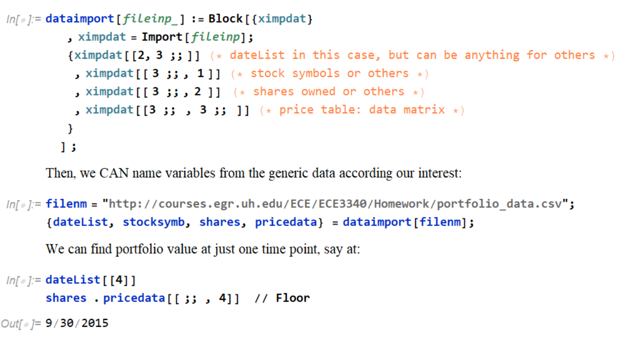
This shows only the structure of a problem matters, not the content.
Portfolio examples
In [1]:
import numpy as np
import pandas as pd
import matplotlib.pyplot as plt
Below, we will do "translation" of Mathemetica code into python
In [6]:
def datacsvimp(filepath) :
    ximpdat=np.array(pd.read_csv(filepath,header=None));
    pricestr=ximpdat[2:, 2: ]; # the price data are strings with $ sign
    # we have to remove '$' and float the numbers
    pricenum=np.array([[float(str.replace(str.replace(a,'$',''),',',''))
                        for a in arow] for arow in pricestr])
    return [ximpdat[1, 2: ] # Mathematica: ximpdat[[2, 3 ;; ]]
           ,ximpdat[2:, 0 ] # ximpdat[[ 3 ;; , 1 ]]
           ,np.asfarray(ximpdat[2:, 1 ]) # ximpdat[[ 3 ;; , 2  ]]
           ,pricenum]
In [7]:
filepath='http://courses.egr.uh.edu/ECE/ECE3340/Homework/portfolio_data.csv';
[dateList, stocksymb, shares, pricedata]=datacsvimp(filepath)
In [8]:
print(dateList)
print(stocksymb)
print(shares)
pricedata matrix can be big. Don't print if not want
In [9]:
value=np.dot(shares,pricedata)
In [11]:
plt.figure(figsize=(10,6.7))
plt.plot(dateList,value)
Out[11]:

Grocery shopping
The idea is that there is no need to create any new code. The problem is structurally the same as the Portfolio, hence use the same code, with exception being variable names for our benefits (not computer).
In [12]:
filepath='http://courses.egr.uh.edu/ECE/ECE3340/Homework/grocery_price_data.csv';
[storename, item, itemquantity, priceGrocdata]=datacsvimp(filepath)
In [13]:
print(storename)
print(item)
print(itemquantity)
The price matrix is not too big, we can print out to show:
In [14]:
print(priceGrocdata)
In [15]:
cost=np.dot(itemquantity,priceGrocdata)
In [23]:
plt.bar(storename,cost,color='g')
Out[23]:

In [ ]: